
Responsive Educational Website Design & Development for Fiovana
Service Provider: Digital Solutions IT
Project Lead: Muhin Ahmed
Industry: Education / LMS Platform
Technology: WordPress (Custom Development)
Project Type: Responsive Educational Website (LMS-based)
Introduction
At Digital Solutions IT, we believe that a website is not just a digital presence it is a complete experience. This case study explains how we successfully delivered a fully responsive Educational LMS website for Fiovana, focusing on performance, usability, scalability, and SEO-friendly architecture.
This project was handled with a problem-solving mindset, ensuring that the website works seamlessly across mobile, tablet, desktop, and large PC screens. The goal was to build a professional, modern, and conversion-focused platform using WordPress Website Development, tailored specifically for the education sector.
Client Overview: Fiovana (Educational Platform)
Fiovana is an educational brand aiming to deliver structured learning experiences through online courses. Their requirement was clear:
- A clean and trustworthy educational website
- LMS-ready structure for future course expansion
- Smooth performance on all devices
- Easy content management without technical dependency
Project Challenges
Before starting development, we identified several challenges:
- Lack of responsive consistency in typical LMS themes
- Poor user experience on mobile devices in many education sites
- Heavy LMS plugins slowing down performance
- Difficulty maintaining SEO-friendly structure in LMS websites
- Need for scalability without redesigning the website later
Our solution was to implement custom WordPress website development instead of relying on bloated pre-made themes.
Our Solution Approach
Why WordPress?
We chose WordPress because it allows
- Full customization
- SEO-friendly architecture
- Easy LMS integration
- Long-term scalability
As a WordPress website development agency, Digital Solutions IT focuses on building performance-optimized websites rather than generic designs.
Responsive Design Strategy (Core Focus)
Responsive design was the heart of this project. We developed separate layout logic for each screen category instead of relying on auto-scaling alone.
1. Mobile Version (Smartphones)
Mobile users form the largest portion of educational website traffic. Therefore, the mobile version was designed first, not last.
Why Mobile Responsiveness Is Important:
- Students access courses on the go
- Faster decision-making on mobile
- Better Google mobile-first indexing
Mobile-Specific Features Implemented:
- Simplified navigation menu
- Thumb-friendly CTA buttons
- Optimized image sizes for fast loading
- Clean hero section without clutter
- LMS content adjusted for small screens
Result: A smooth, distraction-free learning experience for mobile users.


2. Tablet Version (iPad & Medium Screens)
Tablets sit between mobile and desktop, and many websites fail to optimize this version properly. We handled this with a dedicated responsive breakpoint strategy.
Why Tablet Optimization Matters:
- Popular device for online learning
- Used in classrooms and home study
- Requires balance between content density and readability
Tablet-Specific Improvements:
- Two-column layouts for course sections
- Better spacing for touch interaction
- Balanced font scaling
- Improved visual hierarchy for LMS cards
This ensures that tablet users enjoy the same premium experience as desktop users.
3. Desktop Version (Laptop Users)
Desktop users are usually serious learners or administrators. For them, clarity and functionality matter most.
Desktop Design Focus:
- Professional educational appearance
- Easy course browsing
- Clear call-to-action flow
Desktop Enhancements:
- Full-width hero section
- Advanced course grids
- Visual storytelling with structured content blocks
- Faster navigation between pages
The desktop version reflects authority, trust, and credibility essential for educational brands.


4. Large Screen / PC Version
Large monitors require a different content balance. Stretching content is not a solution we used max-width control.
Why Large Screen Optimization Is Important:
- Used by institutions and educators
- Requires structured content flow
- Enhances professional impression
PC Version Optimizations:
- Controlled content width
- Enhanced spacing for readability
- High-resolution image support
- Clean layout without empty gaps
Custom WordPress Website Development
Instead of using ready-made LMS themes, we developed:
- Custom page templates
- Lightweight WordPress structure
- Optimized CSS & JS
- Clean code for future scalability
This approach falls under custom WordPress website development, ensuring long-term value.
LMS Website Development in WordPress
The website was structured to support:
- Course listing pages
- Instructor-focused content
- Learning journey layout
- Future LMS plugin integration
Why LMS Website Development in WordPress Works:
- Easy course management
- SEO-friendly URLs
- Flexible content control
- Cost-effective scaling
SEO-Friendly Architecture
As an SEO-focused agency, we implemented:
- Clean permalink structure
- Optimized heading hierarchy
- Schema-ready layout
- Fast loading speed
- Mobile-first indexing support
This aligns perfectly with WordPress SEO specialist services.
Performance Optimization
Speed was a priority. We ensured:
- Image compression
- Lazy loading
- Minimal plugin usage
- Optimized theme structure
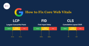
- Core Web Vitals readiness
A fast website means better rankings and better user retention.
E-commerce & Future Expansion
The platform is ready for:
- Paid course selling
- Membership integration
- Payment gateway setup
This supports eCommerce website development in WordPress without rebuilding the site.
Results & Outcomes
After deployment, the website achieved:
- 100% responsive compatibility
- Improved user engagement
- Professional educational branding
- SEO-ready foundation
- Easy admin control
Why Choose Digital Solutions IT?
Digital Solutions IT is not just a WordPress website development agency we are solution providers.
Our Strengths:
- Problem-solving mindset
- SEO-driven development
- Custom design approach
- Real-world performance focus
The project was led by Muhin Ahmed, ensuring quality control from planning to execution.
If you are searching for a WordPress website developer near me, Digital Solutions IT delivers globally with local expertise.
Final Thoughts
This project demonstrates how WordPress website design and development can transform an educational idea into a powerful digital platform.
By focusing on responsive design, performance, and SEO, we created a future-ready LMS website that serves learners on every device.
If you are planning:
- Educational website development
- LMS website development in WordPress
- Custom WordPress solutions
Digital Solutions IT is ready to help you build with confidence.
Need a responsive, SEO-friendly WordPress website?
Get in touch with Digital Solutions IT today.
Telephone: +880 01303-673523
Email: info@digitalsolutionsit.com
Frequently Asked Questions
WordPress was chosen for its flexibility, SEO-friendly structure, scalability, and ease of managing courses and educational content.
Responsive design ensures smooth learning experiences across mobile, tablet, desktop, and large PC screens, improving engagement and accessibility.
Yes, the website follows SEO best practices including clean URLs, optimized headings, fast loading speed, and mobile-first design.
Absolutely. The site is ready for future features like paid courses, membership systems, and eCommerce integration.
This project was developed by Digital Solutions IT under the supervision of Muhin Ahmed, focusing on performance, usability, and SEO.


 Welcome! Together with Digital Solutions IT, Let’s Build Your Future.